It’s only a moderately entertaining commercial whose real value comes from some of the hips that the camera focuses in on as they’re being shaken.
There’s one set of hips in particular that stands out as the woman shaking them is shaking them, as Scott put it, with authority.
(He actually said it as “authoritah,” in an imitation of Cartman.)
In any case, I like her hips and I like the outfit she’s wearing, so I decided that I was going to capture some frames from the commercial and attempt to render the hips at the height of their authoritative thrust.
Before I continue, here is the commercial in question:
So. I had recorded something that ran the commercial during an ad break, but had no luck capturing any decent frames, so I eventually used one of the sites that lets you save YouTube videos and was able to capture a frame from that.
Of course, the quality wasn’t that great, so it took a lot of extrapolating on my part to try to fill in some of the details.
Given that I was talking a little about the process of how I create my artwork earlier today, I thought I’d give you a look at some actual steps in the process, using the Bacardi hip-shaker picture as an example.
This isn’t totally representative of the process, as I used a slightly different technique this time around, but I’ll explain what I did differently as we go.
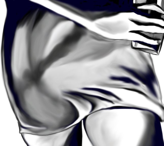
First off, here’s the frame capture at actual size. As you can see, it’s not especially clear or detailed and there’s a lot of noise. I tried to clean it up a little and enlarge it, but that pretty much made matters worse. Ultimately I used it as is.

I did a quick, very rought freehand sketch of the frame at a much higher scale in black and gray using a pencil tool. This was done on a separate, transparent layer so that I would be able to color underneath it.

This is very different from my usual approach, which consists of first using the pen tool to create the basic shapes in a solid color, after which I sketch in the details on layers above the solid color.
I used my favorite tool (the Smudge tool) to blend the blacks and grays together.
Normally, as mentioned, the basic shape would be laid out in a solid color on a level below this, and I would paint in the shading on a layer in between the solid color and the sketched-in details. I would then smudge the sketched layer to add to the depth of the shading layer.
This time around I painted in the solid colors below the smudged sketch layer, then added in some additional shading, did some more smudging to blend everything together, then used the pen tool to clean up some of the lines.
Here is the end result:
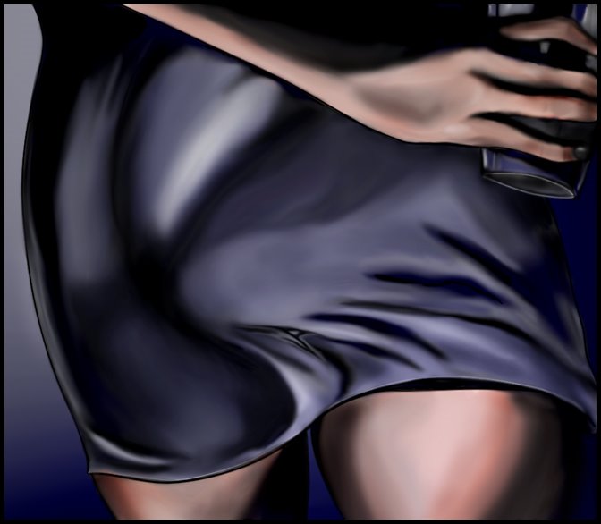
I’m not totally pleased with the end result, as the skirt isn't quite the color or the texture I wanted, but considering the source material I had to work from I guess I can’t complain too much, and the picture itself isn’t really the point, as I did this primarily as an experiment in using a different technique.
While I think the end result is okay, I’m not sure I’m going to use this particular technique again.
Anyway, that’s a little glimpse into the process of creating a picture.

No comments:
Post a Comment