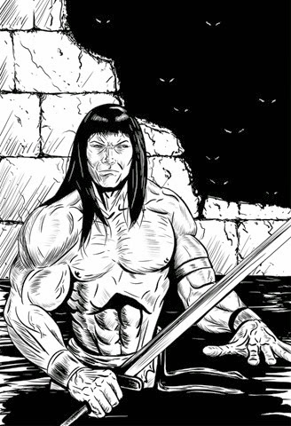
After spending a lot of time trying to think of something to draw, I finally decided on everyone’s favorite Cimmerian, Conan.
I also intended to use this drawing session as an opportunity to work on my inking, and the image that I had in mind was something that was kind of a hybrid of some of the classic Conan artists like Ruby Nebres and Alfredo Alcala, with a lot of hatching, with some elements of Art Adams and Mike Mignola thrown in for good measure.
It was my intention to do a black and white image, a la Savage Sword of Conan, although I considered adding in some gray tones as well.
The basic image, as far as the overall shape and some of the details, turned out okay, but once I started on the hatching it all fell apart because I suck at hatching. Of course, the point of the practice was to get better at it, but that wasn’t happening, and it continues to not happen.
Still, after having put so much work into it, I didn’t want to just scrap it, so I decided to make it into a painting. “After all,” I told myself, “hatching was originally done out of necessity, to make up for the shortcomings of the early printing process in comics. Who needs it? Not me!”
(It’s true that hatching is no longer really necessary, but despite that, I do still wish I was better at it. Or, you know, any good at all. At least with ink – or the digital version of it, at any rate. I’m okayish at it with pencil, whether analog or digital.)
Unfortunately, my attempt at painting it looked like crap, so I scrapped.
Today I decided to revisit it, with the help of some fancy new custom brushes I bought for Manga Studio.
So I drew it all over again, and it looked okay…then I decided to try my hand at hatching again.
The result was…well, here’s the result:
 |
| Hatching is for chumps anyway. |
Because I wasn’t happy with it, I decided to try painting this one.
Here’s the result:
 |
| Understanding anatomy is for chumps anyway. |
1 comment:
I think it looks pretty good. Except for the left thumb. That left thumb looks...well, I shouldn't say. You know what Freud said, sometimes a thumb is just a thumb.
Post a Comment